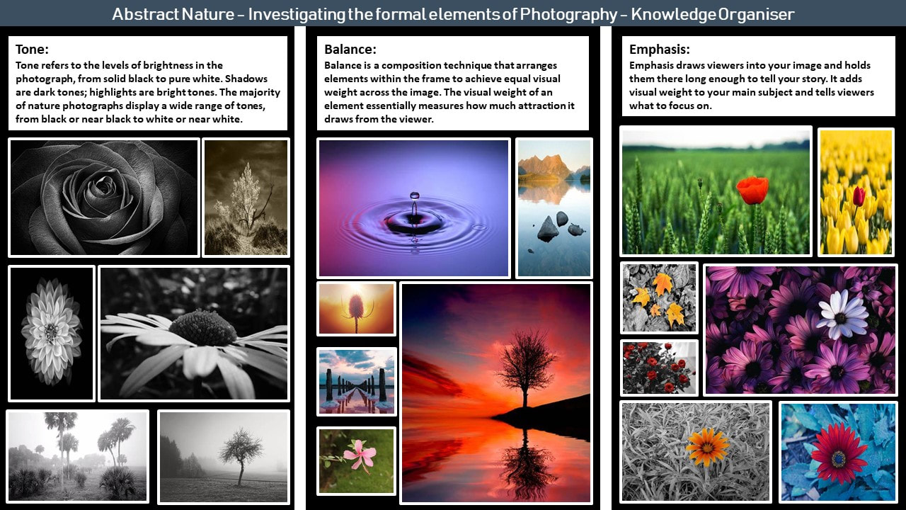
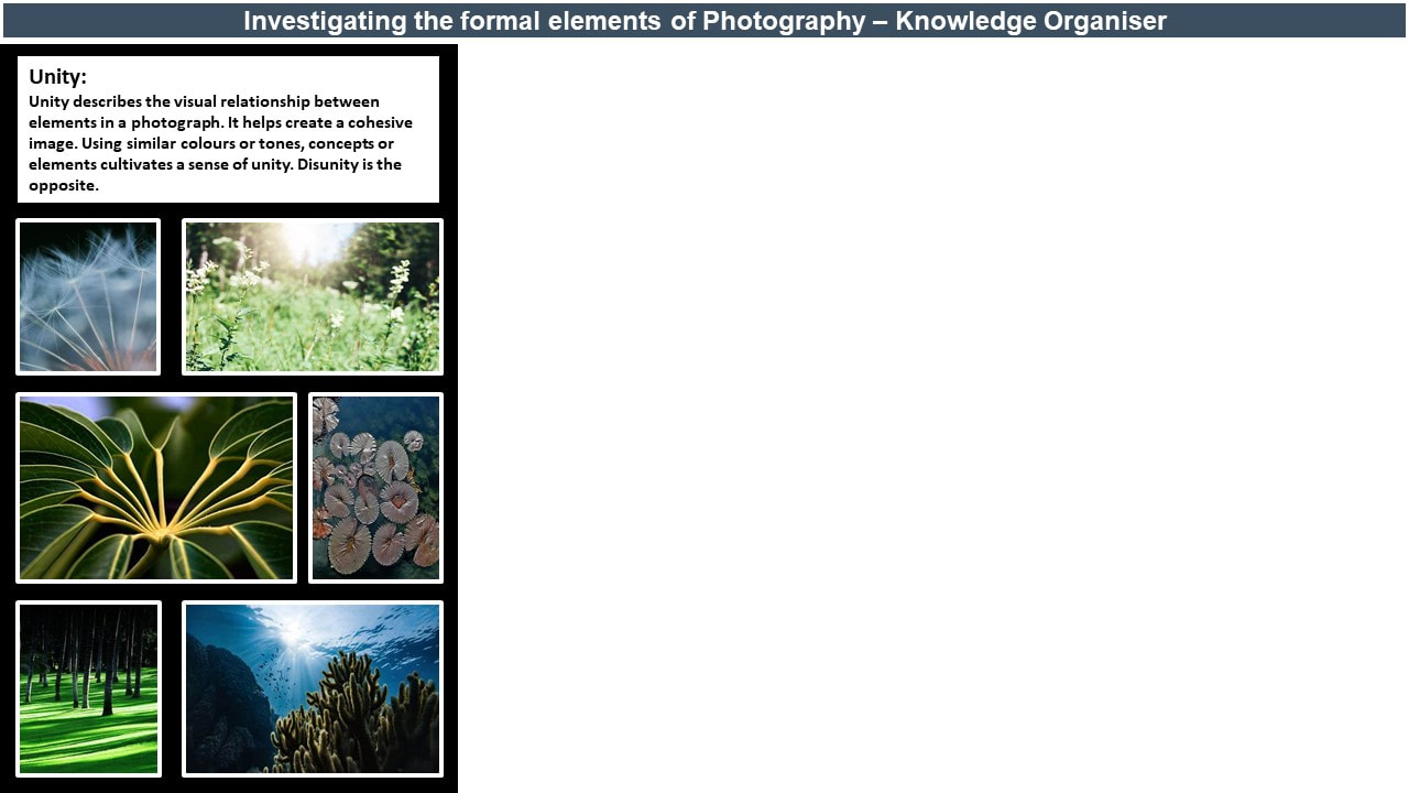
Abstract Nature : Personal Project 1

Abstract Nature : What Is Abstraction
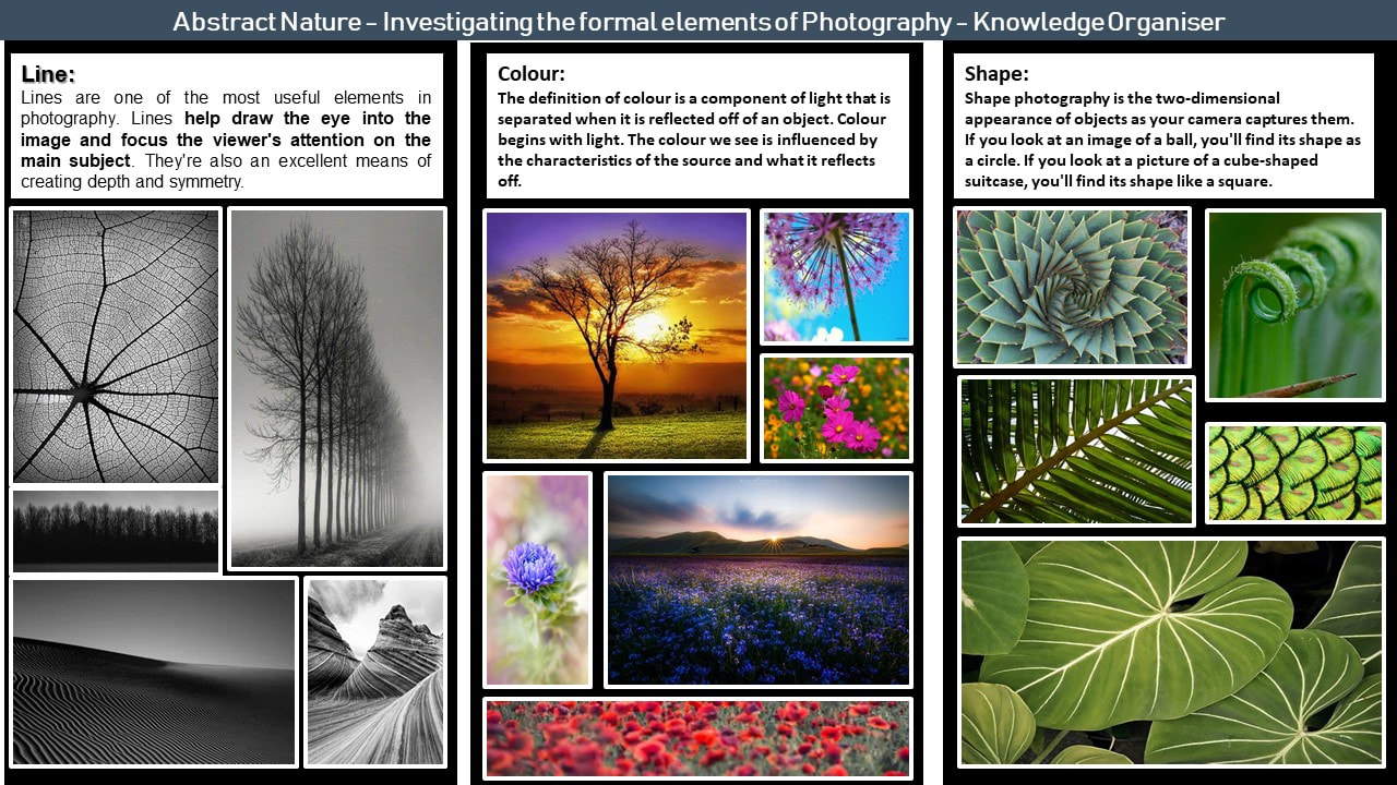
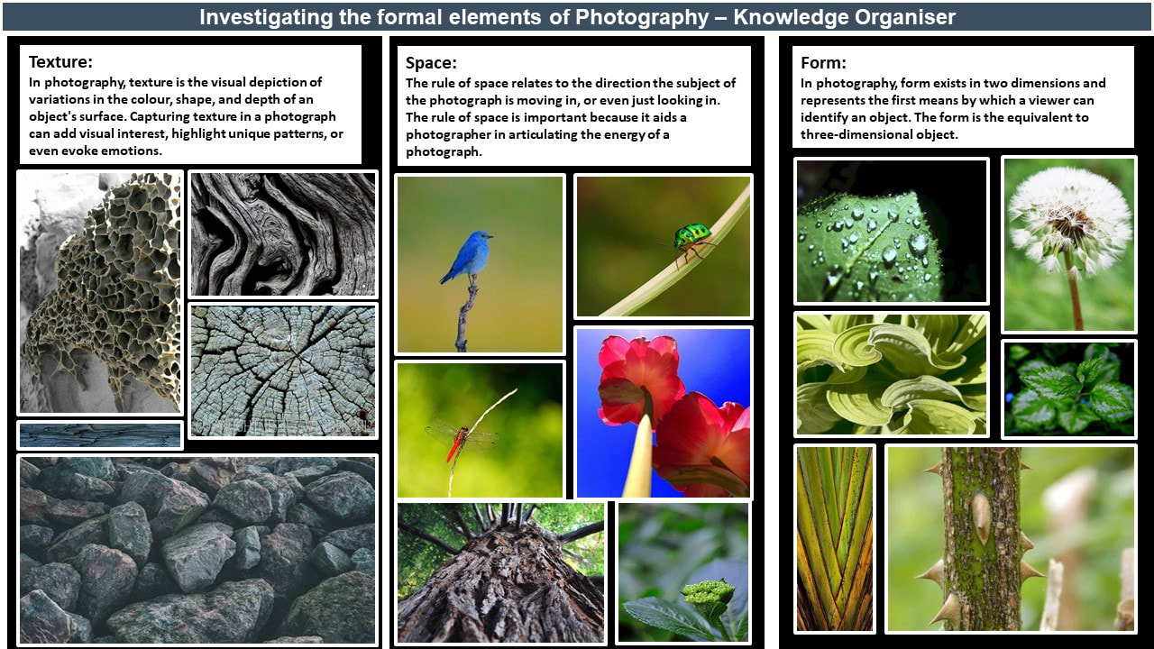
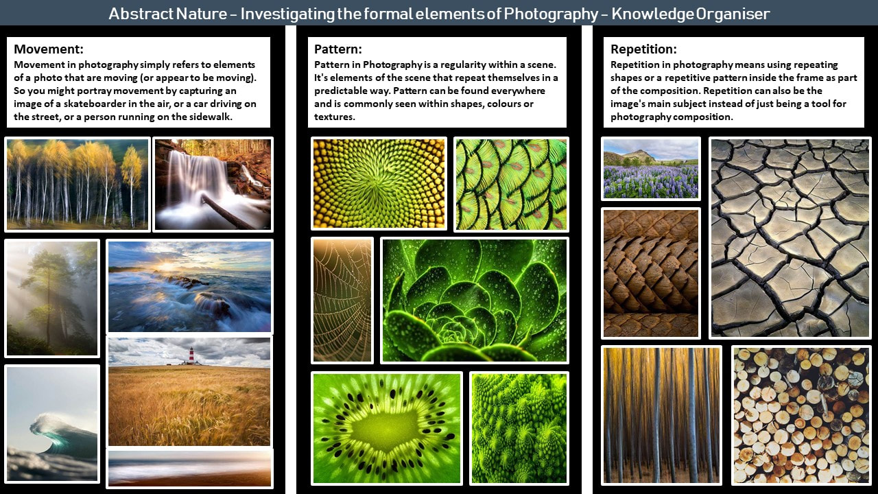
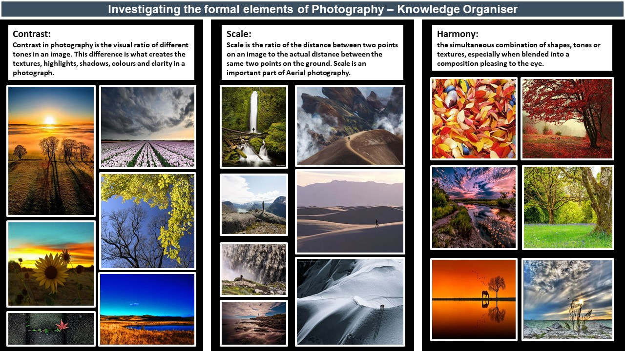
Abstract photography, sometimes called non-objective, experimental or conceptual photography, is a means of depicting a visual image that does not have an immediate association with the object world and that has been created through the use of photographic equipment, processes or materials. Primarily, abstract photography focuses on the elements of art (line, shape, colour, tone, texture, form, space) and the principles of design (balance, harmony, scale, pattern, movement, repetition, contrast, emphasis, unity) . These are also known as the formal elements of photography. Below are some examples of abstract photography that I am inspired by and some initial research into the formal elements of photography.


Abstract Nature: INVESTIGATION OF ABSTRACT PHOTOGRAPHY TECHNIQUES / Monochromatic Photography


|
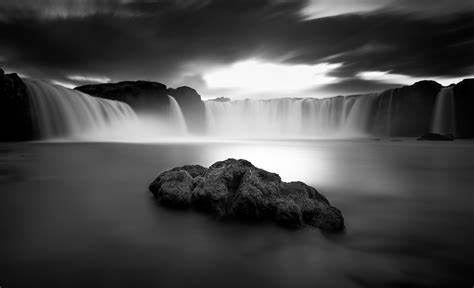
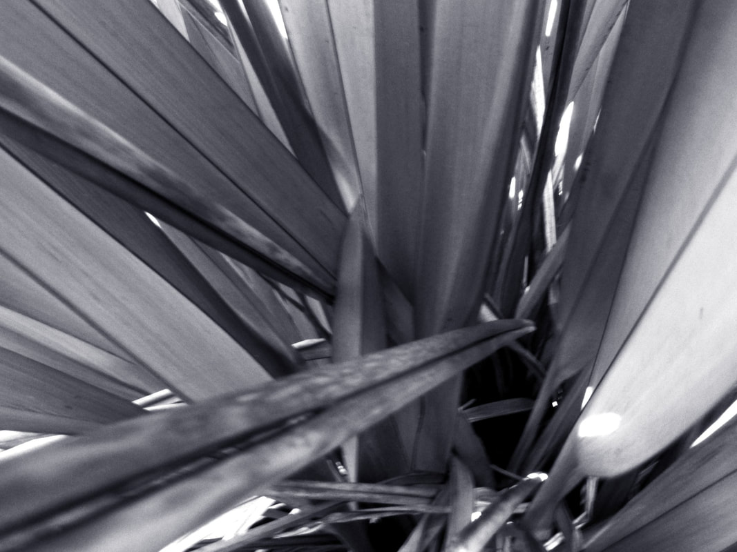
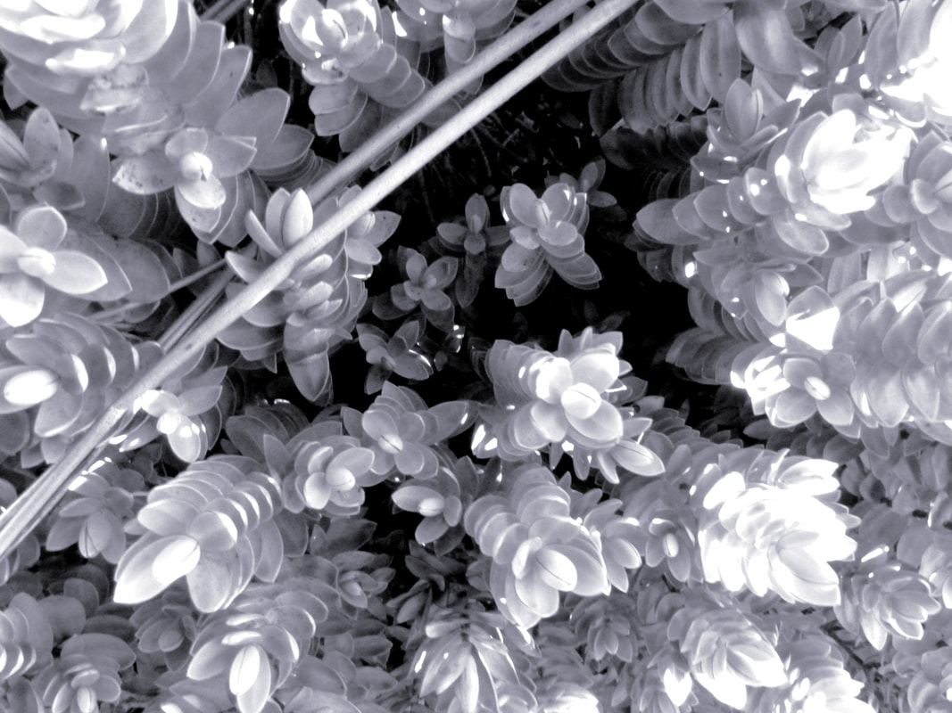
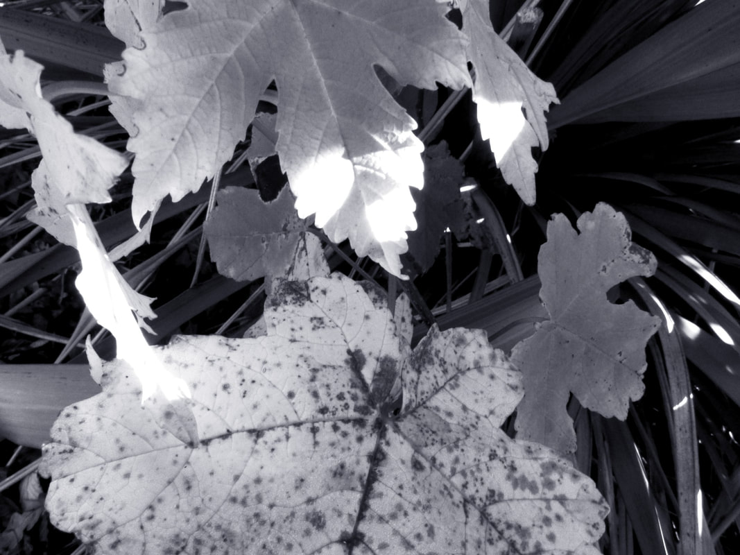
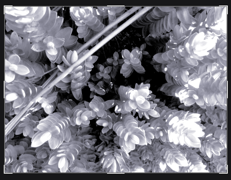
Shooting in Black and white can have many advantages: the most significant being that you can create abstract images that emphasise and draw focus to elements other than colour. No colour means little details such as line, shape and texture are emphasised. This can be effective in photography because it can potentially make an image non as recognisable.
|
|
|
I used my DLSR Cannon camera and a standard kit lens, I changed the settings to a monochromatic (B+W) setting. In this shoot I used both aperture priority setting on f/4 or f/5 this allowed me to prioritise details in the foreground of the image and give less context to the surroundings. Some of my pictures were taken in the bushes and some were taken from an eye view or from a Birdseye view, most of my images had no background but some had some of the sky in the back.
|
|
|
My photos were taken outside. Therefore the lighting was natural and there was no need for artificial lighting as it was a sunny day. This allowed some contrast in lighting and the leaves because of the darkness of the leaves and the sun rays. The weather was the best it could be for this shoot because there was no interruptions and no extra hassle of getting different lighting. I think my images are rather successful because of the amount of detail on the final outcomes of my shoot.
|
|
ICM - Intentional Camera Movement Shoot :


|
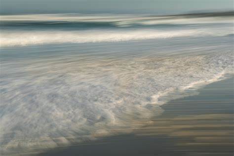
ICM (intentional camera movement) involves a camera having a slight movement. This causes the photos to have a different effect where there could be different lines and the object at different points. This makes the photo look unrealistic because the object is often unidentifiable .
|
|
|
During this shoot I used a DLSR cannon camera with a standard kit lens. I put the camera into shutter speed mode. This is in combination with the technique used, rotating the camera to produce a blurred effect. In some images a focal point will remain even with the movement. I managed to achieve some focal points in my images.
|
|
|
For this shoot I was indoors. I used artificial lighting. The lighting was difficult to get in the right place because I didn't want any shadowing. The majority of my photos were successful although some were too blurred or out of focus. Some of these photos purposely fit the rule of thirds.
|
|
Shallow depth of field shoot :
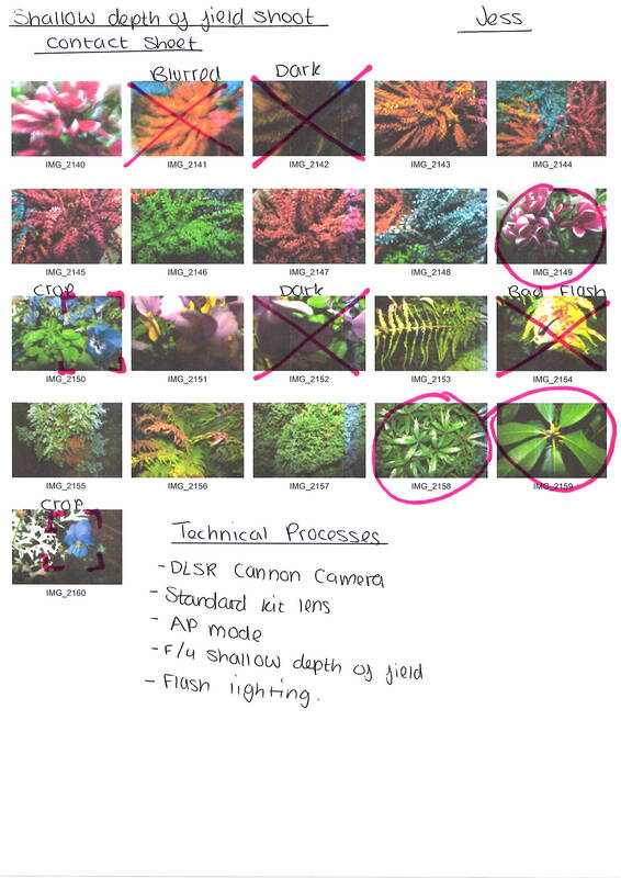


|
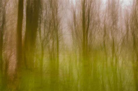
A shallow depth of field can be utilised in abstract photography to obscure the subject's surroundings. This means the photographer has the ability to withhold the context that the background could provide; resulting in an image focused on the formal elements of photography provided by the foreground. The focus on the main object makes the overall photo more abstract.
For this shoot i used a DLSR Cannon camera with a standard kit lens. For the lighting I used the camera flash as it was dark. The setting of my camera was on AV priority mode. The rule of thirds fits a few of my photos. Some of my photos are blurred and out of focus. For some of my photos i got quite close up to get the best focus I could.
I used a variety of different angles to get these photos : Birdseye, eye view and from the side. The benefits to this shoot is the fact the main object is clear and draws attention and the background is less focused.
|

|
Abstract Nature : Best Edits (Monochromatic Shoot)
|
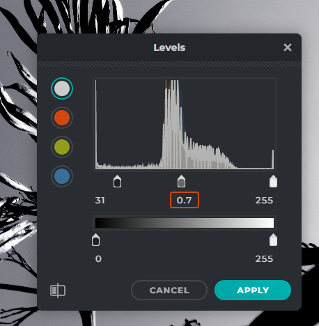
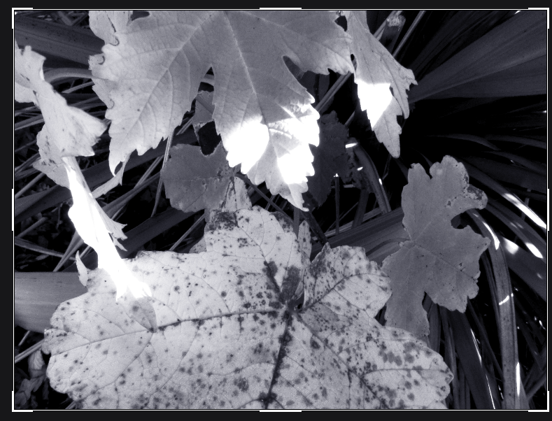
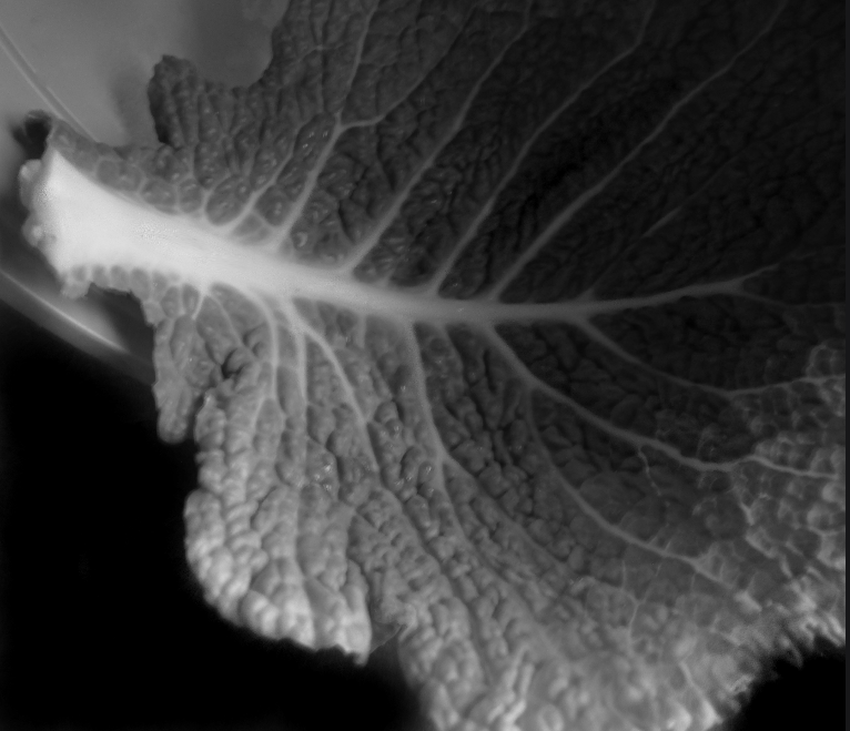
I chose this photo was one of my best final edits because of the shades of grey and white amongst the dark leaves. It gives the effect of the sun shining down on the plant. To edit this photo I changed the levels of the monochromatic colouring. I also added a slight shade of blue to the image to make it look a bit silvery. By doing this I managed to draw attention to the certain points of the individual leaves. This image required no cropping because the rule of thirds fits this photo well.
I chose this as my second best final edit because of the amount of line detailing. I also think the different shades of grey make it look like there is more texture in the photo. To edit this image I used the same techniques as the last photo. Although I used less blue toning and more pale greys. This image also required no cropping as I liked the full photo being at that angle in the bush.
This is my third final edit and I chose this because of the angle the photo is taken at. All of the detail of the small leaves are in different tones because of the editing techniques I used. I also like how the bottom bits of the plants are in a darker shades. I made this photo lighter than the previous one because I felt like it made the details more obvious. There was no blue tones used on this image but I used the cropping tool to get a closer image.
I chose this photo for my fourth final edit because of how different it is compared to my other final edits. I liked the fine details on the bigger leaves and the background being strands of grass added more texture to the overall image. To edit this photo I used the level tool to add more depths of the grey. I did not use the blue on this photo because I don't think it needed the extra colours. Although I did crop the photo down so it is closer up and so that the extra grass was not in shot.
|
Artist Investigation / Edward Weston
“The camera sees more than the eye, so why not make use of it?” – Edward Weston
“This then: to photograph a rock, have it look like a rock, but be more than a rock.” – Edward Weston
Why these quotes?
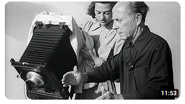
I chose these quotes because they reflect on how photography is much more than just a still picture and it can have some sort of extra meaning to it. Why this video? I chose this video because it gives a glimpse into how Edward Weston forms his photos and it also shows off some of his best work. |
Why this artist ?
To begin my Abstract Nature artist investigations I will initially study the work of Edward Weston because he demonstrates abstract nature photography. Some of his most recognisable photography is of vegetables such as green peppers and cabbage leaves , these photos have a very high detailing to them. Who is he?
Edward Weston was born in 1886 on the 24th of march and he is known for being one of Americas innovative and influential photographers. During his career in photography he has explored many genres and subjects. His main subjects were natural forms, landscape, nudes and people. Below are 10 images that are inspirational to me because I think all the small details add together to form a unique photo.
|


SEMI Analysis / Edward Weston
|
Subject
The title of this photograph is 'Pepper No. 30' it was created on August 3rd, 1927 by the photographer Edward Weston. It became one of his best known photos because of the eye catching form, lighting and composition of the green pepper. It is best fit in the genres: Abstract Nature photography and still life. To create this image Weston has used a strange shaped green pepper and a tin funnel creating the background of the photo. Elements
The photographer has used composition and perspective to show the subject. To create balance in this photo Edward Weston has used the rule of thirds. Although the focal point is not centralised all aspects of the pepper are equally distributed. The perspective that Edward Weston has taken the photo from is at eye level. This is effective because it presents the viewer with a familiar perspective, balancing this with the unfamiliarity of the form and abstract style. The viewers eyes are lead around the image by the curvy lines all around the pepper. The unusual shape of the subject (pepper) is partnered with the dramatic lighting and low exposure. The photographer, as I have previously mentioned, employs a range of visual elements. The most appealing are shape, value, space, and form. The extreme light and dark tones invent simplified shapes characterised by single tones, that help the viewer to understand the form of the subject by looking at smaller areas. The space in the background makes the main subject look more intense and detailed , it also draws the attention of the viewer straight away. Media
Shallow depth of field is used to emphasise the detail of the subject in the foreground and middle-ground as well as further remove the background, enhancing abstractness in the image. It is a close up , still-life image and it is taken from a short distance. The camera has been carefully placed to ensure the composition is balanced or the image could have been cropped to bring the subject closer and minimise the tin background. The dark background causes a dramatic and negative affect although the main focus has a soft look to it although, the pepper has a sense of sadness towards it. The juxtaposition of tones draws full focus to the solitary subject, which in itself is well balanced, as the viewer's eye is drawn around it. The light source is placed above which results in reflecting light highlighting the important contours of the subject matter- this is how the leading lines are made. This lighting portrays the pepper in three dimensions, rather than a flat image giving the image dynamism and atmosphere. Intent
Edward Weston always experimented with abstract photography throughout his career and is credited as an innovator, who pushed the boundaries of photography. He chose to photograph 'normal' objects, that appeared to have no particular visual intrigue, and by doing this he made us believe that there is much more character to normal, basic items than we think. He aimed to capture the details in common objects by presenting them in a way that best brings out the fine lines and imperfections on the objects. Despite Weston's expressed aversion to the interpretations of "pepper No. 30" as sexual or having the appearance of nude figures, I believe it is a valid interpretation. The pepper is curvaceous as a woman and has the same moving lines that a woman would have. The form is expressive: lines elegantly flowing into one another, creating a subject with a cycle of form flowing into itself. This photograph has many strengths: its dynamism, the movement of the form, and depth of tone- providing its 3-dimensional appearance. |

Pepper No. 30 - 1927, Edward Weston


|
Technical Processes / Low Key Photography
|
Low key photography is a genre involving the lowering the camera exposure. The aim of this is to create a much darker background, to highlight fine details and information in the object
Low key photography can create more dramatic and detailed images and it can conceal the light better in certain places, this helps to create shadow. This also works to emphasise the limited lighting only present in specific areas of the image. This also creates dark and light aspects on the photograph. |
Shoot Plan / Edward Weston

|
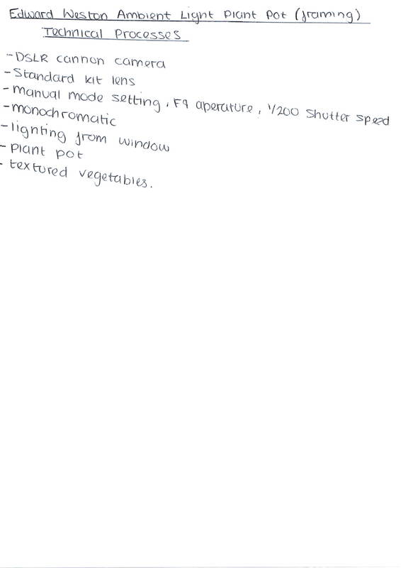
This shoot is inspired by the work of Edward Weston, more specifically his monochromatic photography , low key depictions of vegetables in abstraction, this links to our current theme of abstract nature as the aim of his shoots is to show us how the vegetable can turn into abstract context. I have completed this shoot in our weekly photography lesson that we do during the school day. Doing this shoot indoors can effect my shoot and how much natural light is reaching the camera lens. This can effect my shoot because if I don't get enough light in my lens my image will be under exposed and wont show enough detail.
|
To replicate Edward Weston's work specifically his image 'Pepper No. 30', I will use similar props and I will experiment with different types of vegetables, placing the object inside of the plant pot. Therefore exposing them to the light source at different angles it emphasise the form due to the limited source of light minimising the number of light sources which well then help me in creating images in a low key style of image I'm trying to recreate. The plant pot will help me recreate the vignette framing the pepper in Weston's work, it will also provide a dark background space. To stop to much light getting into the plant pot I will use a piece of black card where the pots draining holes are to shield it from the light source that I don't want or need because the light from the bottom can cause the vegetable to reflect in the wrong places. And to stop the camera from shaking I will try to hold my camera as still as possible.
For this shoot, I will use a DSLR camera and the standard kit lens. I will use manual setting to gain better control over the shutter speed, aperture and ISO. I will use a Low ISO setting, mid-large aperture (depending on the amount of light available) and slow shutter speed. To be specific I will use an aperture between f/4 and f/8, an ISO of 400 and a shutter speed of 1/160. To hold my camera still I will just try to keep my hands steady.
Contact Sheet / Edward Weston
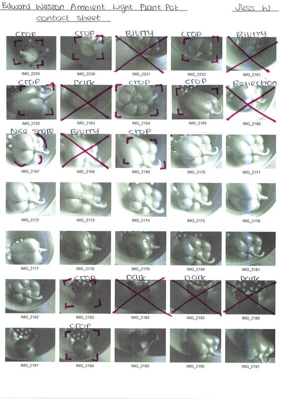
|
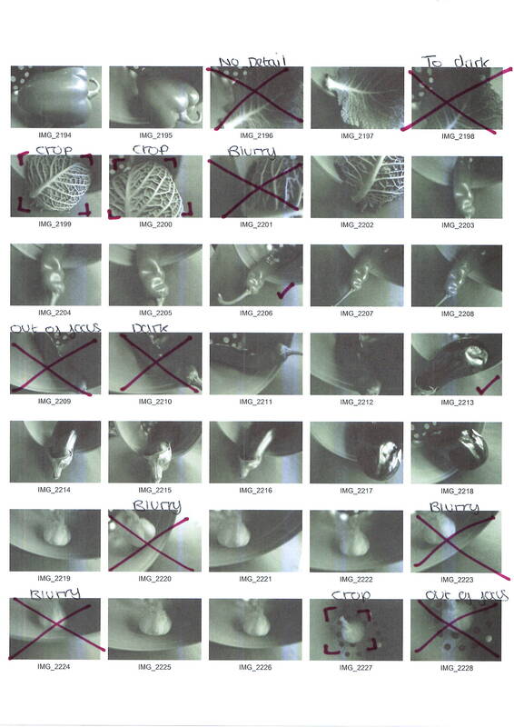
|
|
Editing Process/ Edward Weston

step 1 - First I cropped the image to get rid of the unnecessary part where there is nothing there. And so that there is only focus on the small details of the object.

Step 3 - Next I used the lighten tool to make the white part of the vegetable more bright and bold. I only did this a small amount to create a subtle affect.

Step 5 - For the final step I made the background darker to make the object the main thing you see .
|

Step 2 - Then I used the sharpen tool to brush over some places on the textured vegetable to draw more attention to certain aspects.

Step 4 - For this step my editing I increased the vibrance of the majority of the vegetable.

FINAL EDIT
|
Best Edit / Edward Weston
|
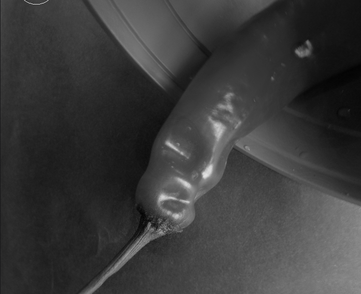
I chose this image as my best edit because of all of the small details throughout the vegetable. The darkness of the background makes the attention be drawn to the vegetable and not the background. Throughout the editing process, which is shown above, I wanted to create a low key photo and I feel as though I somewhat achieved this. There is definitely some ways I could improve this. For example I could create more shadowing in parts of the vegetable and some of the small, lumpy texture could be a bit more defined.

I chose this as one of my best edits because of the sharp details on the top section of the vegetable and also on the slightly damaged part of it. I also used the dark shadowing tool to make the darker half of the background more dark and used the light shadowing on the brighter side. I really like the shininess on the vegetable because I feel as though it adds texture to the overall image.


I chose this as one of my best edits because of the peculiar shape of the vegetable and because of the light that hits certain parts and creates a shiny aspect. I used the shadow tool on the whole background this causes the subject (vegetable) to be the main attention. To cause more depth in the plant pot I also used the shadowing tool along the side of the vegetable and plant pot.

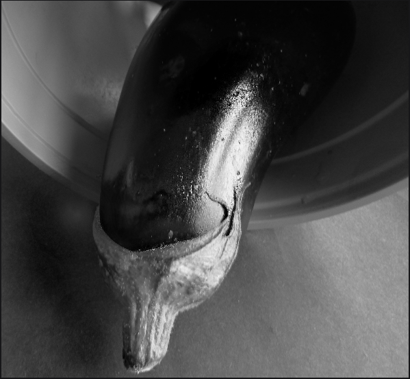
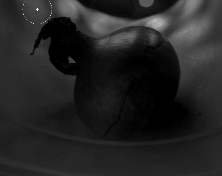
For my final chosen best edit I chose the onion because of the darkness and the cracked line in the middle of it. I made the majority of the vegetable darker apart from where the light shines in from the bottom of the plant pot. Then I used the sharpening tool to make the crack more obvious . To finish editing this I used the shadowing tool again at the bottom of the onion to cause a shadow / blend between the subject and plant pot.
|
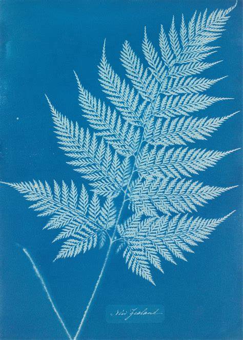
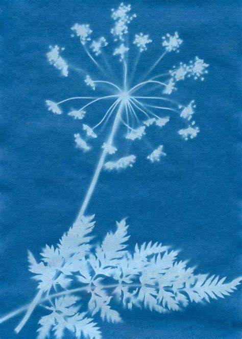
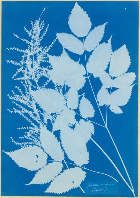
Abstraction through Cyanotypes / Anna Atkins
What are the advantages/disadvantages of cyanotype?
Atkin's use of cyanotypes was important as she was depicting her specimens in a way that allowed botanists to study accurately scaled and detailed impressions of plant-life. An advantage of using cyanotypes is that it is completely safe as there is no harmful chemicals involved. Another advantage is that it is a very simple process. A disadvantage would be that because the plant is completely flattened it doesn't pick up and of the dimensions. How are modern cyanotype artists using this method today?
Cyanotypes are less frequently used today than they used to be although some artists like Zhang Dali who is an artist based in Beijing. To develop the cyanotype, the paper is simply washed in plain water. The areas exposed to light become blue shadows and mid tones the excess unexposed parts are washed away, creating highlights. |
Who was Anna Atkins?
Anna Atkins (1799-1871) was a British botanist and photographer. She is potentially the first person to publish a book illustrated with photographic images. Her work, especially her series of cyanotypes depicting various natural specimens, was important in developing our understanding of the science of botany. This is because of the incredible detail captured in these images. What are cyanotypes?
Cyanotypes are one of the oldest photographic printing processes in the history of photography. The distinctive feature of the print is its shade of cyan blue, which results from its exposure to ultraviolet light. However, with its versatility and affordability, the technique was adopted by photographers soon after its discovery.
|

|
ANNOTATION
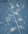
To make my cyanotypes I used paper for three of them , a small fabric square for one and then I used paper and acetate to create a negative. I think my fabric cyanotype turned out the best because of all the finer details of the natural form, I also like the lose thread around the edges of the fabric. If I was to have another lesson on this and to make a larger version I would make a fabric cyanotype because I feel as though it picks up the most detail from the process and it is also a simple process. |
Abstraction through Photograms / Man Ray
|
Who was Man Ray?
Man Ray (1890-1976) was an American visual artist who spent most of his career in Paris. He produced major works in a variety of media but considered himself a painter above all. Although he was mostly known for his contribution to the Dada and Surrealist movements. He is also particularly known for his work with photograms, also known as Rayogrammes. Man Ray often used light and shadow in his photographic work. His photograms are the epitome of his experimentation with this artistic characteristic. What are photograms? A photogram is a photographic image made without a camera by placing objects directly onto the surface of a light-sensitive material such as photographic paper and then exposing it to light. What are the advantages/disadvantages of photograms? Some advantage of photograms is that you have much more control over the layout and design of your image. This process is also a great way to create abstract images as the stark contrast of the bright white create abstract images and black exposed background, make the object stand out distinctly. Disadvantages of photograms include, it is much harder to achieve certain levels of detail therefore many genres of photography cannot be practiced e.g. portraiture. The final outcome of the image is often more unpredictable as the amount of detail that will be picked up is limited and inconsistent. The process also involves various chemicals and a dark room- something some people don't have access to and/or can have health and safety risks. |


|
College Visit / Dark Room Workshop


These are some photograms produced during a dark room workshop. The process was creating photos without a digital camera, and artistic experimentation with the chemicals and physically editing the background's development.
Above are some images of the direct chemical trays and paintbrushes used to created the drip and stripped backgrounds in three of my images. The other photo depicts the enlargers.
Above are some images of the direct chemical trays and paintbrushes used to created the drip and stripped backgrounds in three of my images. The other photo depicts the enlargers.
Horst P. Horst / The unfamiliar and abstracted
Fashion photographer Horst P. Horst used rotational symmetry to create new patterns. His book, Patterns from Nature (1946), has inspired me to create my own series of rotational symmetry patterns using my work so far. Here are some of my examples:


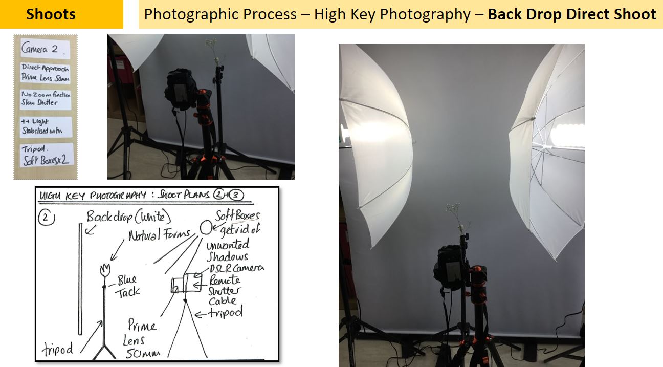
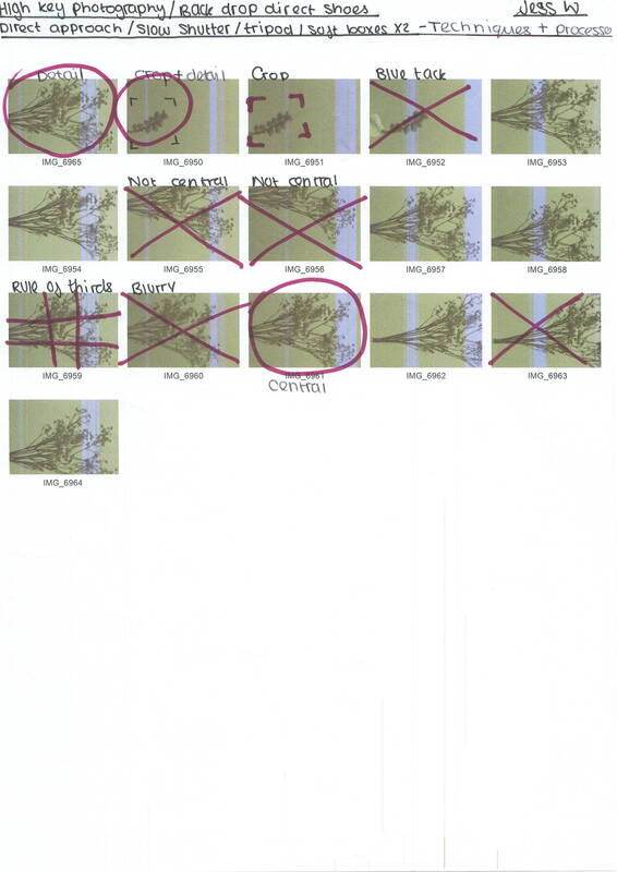
Technical Processes / High Key

|
A high-key image consists primarily of light tones without dark shadows. A photograph or painting so composed features a diminished tonal range of primarily whites and light greys.
Using high key lighting gives your image a unique look. These photos are perfect for creating a happy feeling when the viewer sees the image. If you want to convey a sense of joy, high key lighting is typically the best way to do that. The exposure of a high-key shot is usually slightly flat, and made up of mostly mid-tones and highlights. There aren't a lot of deep, dark shadows in a high-key shot. This lighting strategy portrays a happy , positive ,upbeat feeling, making it perfect for comedies. |


Equipment Used


Shoot Plan Diagram


|

|
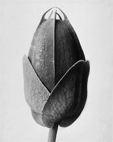
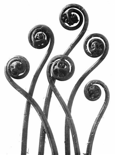
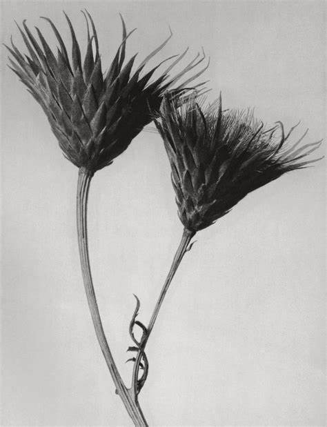
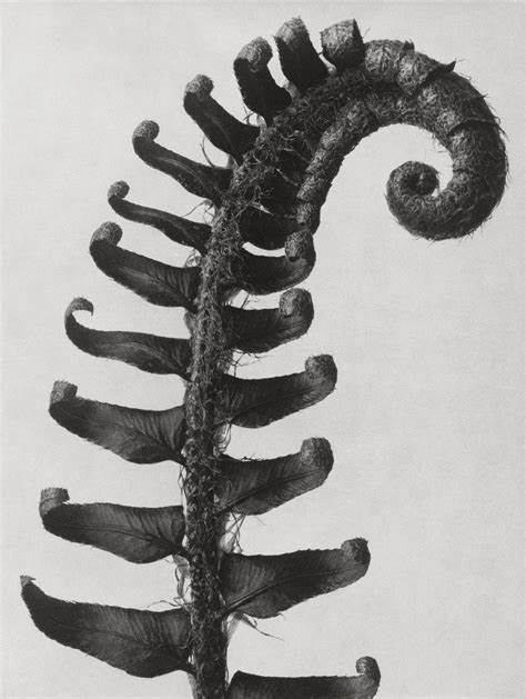
Shoot Plan / Karl Blossfeldt
This shoot was inspired by the artist Karl Blossfeldt as I have been studying the way he creates his abstract forms of nature photography and I have been keen to emulate his ideas.
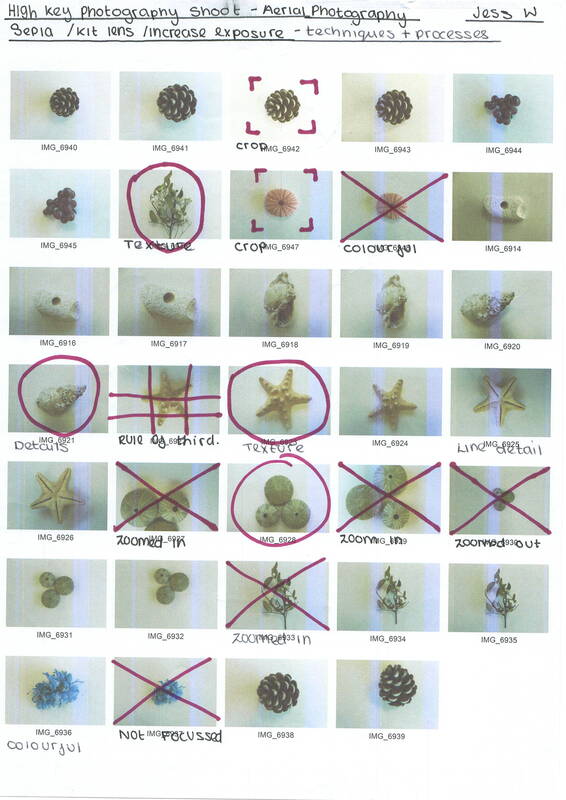
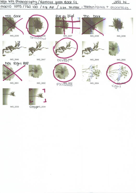
This shoot will take place inside of the classroom as that is where I have the most control over the lighting. In the classroom I will also be able to set up the correct equipment for the 3 shoots to experiment the different techniques of high key photography.
The props that are going to be used will be natural forms such as flower heads and also things like sea shells as they provide a good amount of lines, texture , shape and form. For the background of the shoots I will use a white backdrop.
For my photos I will shoot in high key using a combination of soft boxes, remote flashes, Perspex diffusers and natural ambient lighting. I will need to control the lighting to avoid shadows and distance my subject matter (the natural form) away from the backdrop.
I will use the school DSLR Cannon camera with a prime lens of 50mm and a macro lens and my own camera, I intend to shoot in sepia which is a picture style setting to give the aged look to the photographs.
In all 3 shoots I aim to use a slow shutter speed to let more light into the camera lens but will stabilise the camera with a tripod/books so finer details can be captured and no blurriness.
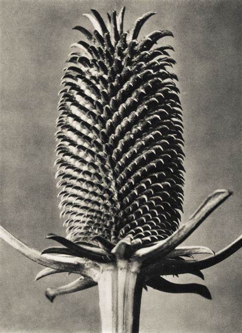
Artist investigation/ Karl Blossfeldt
Nature educates us into beauty and inwardness and is a source of the most noble pleasure. |
Why this artist?
This artist was chosen because he links to our topic of abstract nature, as an artist whose entire skill set explores botanical subject matter. He has had a large influence on modern photographers, and is considered by some a master of still life. By looking at his work, we can explore natural forms both intended to explore visual satisfaction and beauty. |
If I give someone a horsetail he will have no difficulty making a photographic enlargement of it - anyone can do that. But to observe it, to notice and discover its forms, is something that only a few are capable of. |
Who is he?
Karl Blossfeldt was a German photographer and sculptor. He is best known for his close-up photographs of plants and living things. He was inspired, as was his father, by nature and the ways in which plants grow. He was born on the 13 June 1865 and then died on the 9 December 1932. Why these quotes? These two quotes, explore artistic aesthetics influencing Blossfeldt. The first quote emphasises the theory of the enlightenment movement of 'looking at the beauty of nature' relishing in it as a ' source of the most Nobel pleasure'. |

|
Why this video?
I chose this video because I feel as though it clearly explains Karl Blossfeldt's photography. I also chose this video because it looks at the influences of Karl Blossfeldt and the context behind his growth as an artist. It also shows his book : Karl Blossfedlt the complete published work is shown, giving us a comprehensive look at both the development of Blossfedlt's style as well as the extent of his photographic work. |
|
|

|
|
|
|
|

|

|

|
SEMI Analysis / Karl Blossfeldt
|
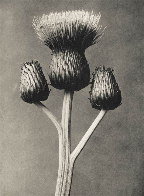
Subject
My photographer is called Karl Blossfeldt and the title of this photograph is Saxifraga Willkommiana made between 1898 and 1928. The genre of this photograph is still life, however in my opinion it also looks like it has use of abstraction. The props I can see in this photograph is the natural form of the plant. Blossfeldt's work mainly features botanical structures, photographed against a plain background to enhance the subject's form and structure. A majority of his still life images are highly magnetized, making them somewhat unearthly: unrecognizable from the everyday look of the object. Elements The artist uses the 7 visual elements of art of form , line , shape and space in this photograph. In my opinion they are the strongest elements used. Form is an example in this photograph because that is how the object is made and it isn't a normal shape it is very unique, a further example of form within the photograph is the fact there is symmetry for each quarter of the subject . Space is used in this photograph because of all the gaps within the object and the large area around the edge of the object. This simplification of the photograph allows the viewer's focus to remain on the subject matter, furthermore, the contrast between the lights and darks of the background and subject create balance again striking the viewer. Media The main focal point of this photograph is the centre because it has a darker tone than the rest and the details are all closer together. He may have used cropping to aid his compositions: using rule of thirds and centralization. Blossfeldt's work can be described as high key, he limits contrast between highlights and shadows resulting in a straightforward outcome. This is achieved through his use of lighting, composition and perspective: his photos likely utilize direct approach or aerial photography. The high key style lighting, as I have previously mentioned, reducing the lighting ratio, allows more focus to be placed on shape and line, perfect for use as a drawing reference. Blossfeldt never looked very far when choosing his subjects, he never bought his subject matter generally using specimens found in his garden. Intent Blossfeldt's use of enlargement means his subjects gain an unearthly quality, this in turn with the sepia, smoky and grey tones of his images provide a sense of industrialism and architecture. The unique approach Blossfeldt takes in his use of macro photography is arguably the reason why he has retained significance so long after his death decades ago. He does not photograph specially selected objects but merely objects of nature easily accessible to him such as from his garden or potentially local nature areas. The unique ode to the past he creates in contrast with the futurist quality the botanical subjects gain is simply due to his style of magnification, as it means the objects are not like anything we would see in our everyday life. In his work Blossfeldt aimed to showcase the beauty of nature through his photographic creations- this is typical of the 19th century enlightenment movement: focused on appreciating beauty and reading into the meanings of the metaphysical in nature. |

Saxifraga Willkommiana
1898 - 1928


|
Karl Blossfeldt / Contact Sheet
|
|
|
9 Best Photos


Editing Process

|
To edit this photo I firstly used the cropping tool get dispose of the excess plain background, I selected the ratio box to automatically place a box around a section. After this I used the wand select tool to brighten the remaining background, I also used the tint option to create a more sepia tone.


|
Artist Investigation / Dennis Wojtkiewicz
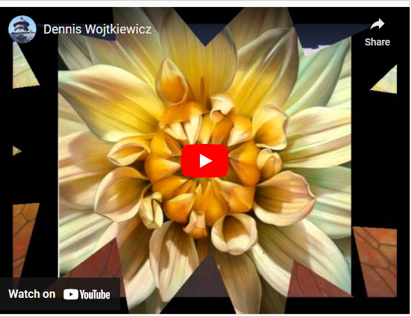
|
Why this artist ?
Dennis Wojtkiewicz is the last artist we will study in the Abstract Nature project. This artist is different from the previous artists we have studied because his main media is painting not photography. Although there are similarities in his macro, still life photography of natural specimens (work similar to Weston) and a style of analytical photography (like Blossfeldt's work). Who is he ? Dennia Wojtkiewicz was born in 1956 in Chicago, Illinois he is an american hyperrealist painter and draughtsman. He is best known for his large scale renderings of sliced fruit and flowers. Why this video ? I have chosen this video because I think it showcases Wojtikiewicz's work nicely, it also shows the amount of effort he put into each piece of his work. The video demonstrates Wojtikiewicz's use of colour and pattern in his work. |
Email Quote – Direct Artist Response
I use a Canon EOS 90D camera with a Canon EF 100mm f/2.8 Macro USM fixed lens. The only reason I even know about the technology is because my colleague told me that's what I needed and would be the biggest bang for the buck. The rest of it is all by feel. I have absolutely no photo training. For me that suffices because I'm not hung up on technical stuff. Just looking for ways to capture information for my paintings. Dennis Wojkiewicz / Jan 2022


Photographic Techniques / Back Lighting Fruit

|
What is backlighting ?
Backlight in photography involves positioning the main light source for a photograph behind the primary subject. Backlight photography emphasizes the depth behind the subject and gives images a greater sense of place. Backlighting can produce a dramatic contrast between the subject and the background. Equipment needed :
|
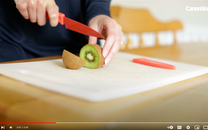
Step 1 : Using a sharp knife carefully cut your fruit into the needed size segments.
|

Step 2: Set up your Perspex glass sheet between two stable objects.
|

Step 3: Set your camera to the correct settings.
|

Step 4: Test out different ways to get the picture you would like.
|
Shoot Plan / Dennis Wojtkiewicz
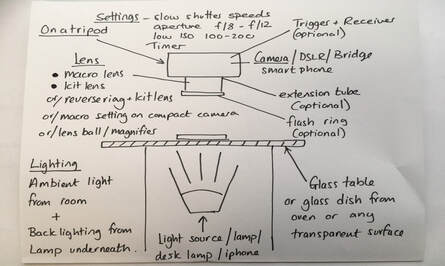
|
- This shoot has been inspired by the paintings of Dennis Wojtkiewicz, he uses backlighting to create his reference images and a main feature of his paintings is colour- this is what I will attempt to emulate: the vivid and vibrant colours seen in his work.
- This shoot will be conducted indoors, giving me control of the lighting. There will be ambient light coming from the window, however the majority will come from the LED light placed under a glass sheet placed across two chairs. This is what the fruit slice will be placed on as the transparent surface will allow the light to pass through the table and illuminate the delicate details of the subject. |
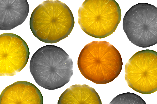
- I will use a range of fruits such as a kiwi, orange, lemon and lime. It is essential that they are sliced thinly, otherwise the fruit will not be translucent enough for the light to reveal its fine details. Moreover, I will also need a knife and cutting board.
- For this shoot I will be using a DSLR camera with a macro lens. To eliminate camera shake I will use both a tripod and remote release cable for both aspects.
- The camera settings will: have an aperture of f/8-f/12; low ISO for better image quality; slow shutter speed to allow lots of light in the camera: a two second timer to reduce camera shake and finally in the extreme macro/reverse ring element of the shoot, will have a longer 4-5 second timer as avoiding camera shake is essential to capture any clear details.
Explosion Sketchbook
|
|
|
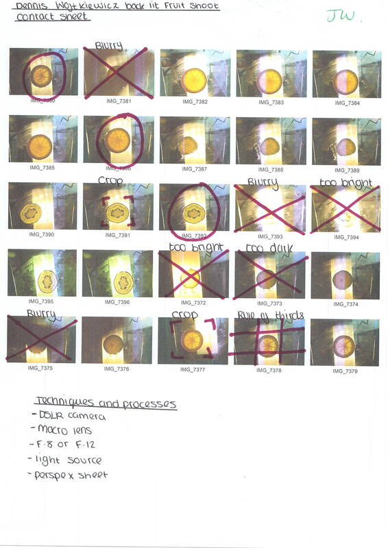
Contact Sheet / Dennis Wojtkiewicz
Post Editing / Dennis Wojtkiewicz

Editing step 1 : In this clip I used the adjustment tools to change the overall tones of the fruit. I did this using the brightness and contrast , temperature and tint , hue and saturation tools. This helped to bring out fine details in the fruit slice.
|
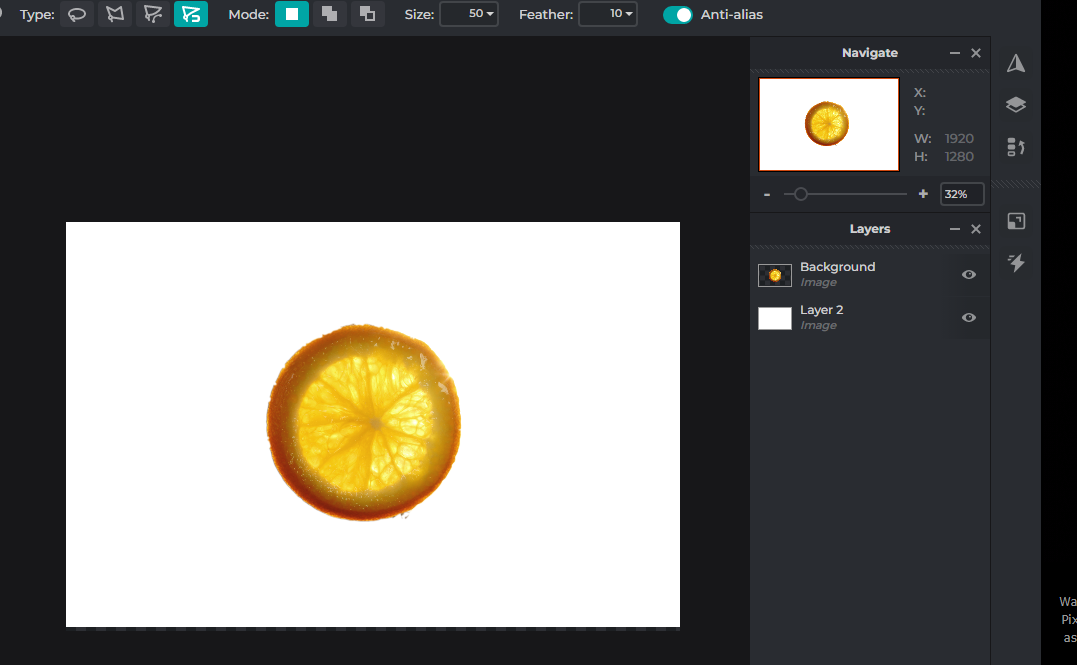
Editing step 2 : In this screenshot I changed the background from the light and Perspex sheet to a plain white background. To do this I used the lasso affect tool on the magnetic setting.
|

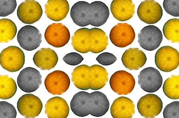
Editing step 3 : Using Pixlr E, I then used the duplicate tool to make many copies of the fruit slice, I then used the rotational tool to make them look a bit different to each other.
|
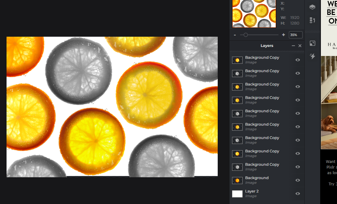
Editing step 4 : Finally , I used the auto B&W tool and the auto pop tool from the adjustment section to make the fruit slices different colours. I also used the saturation tool to make some a bit brighter.
|
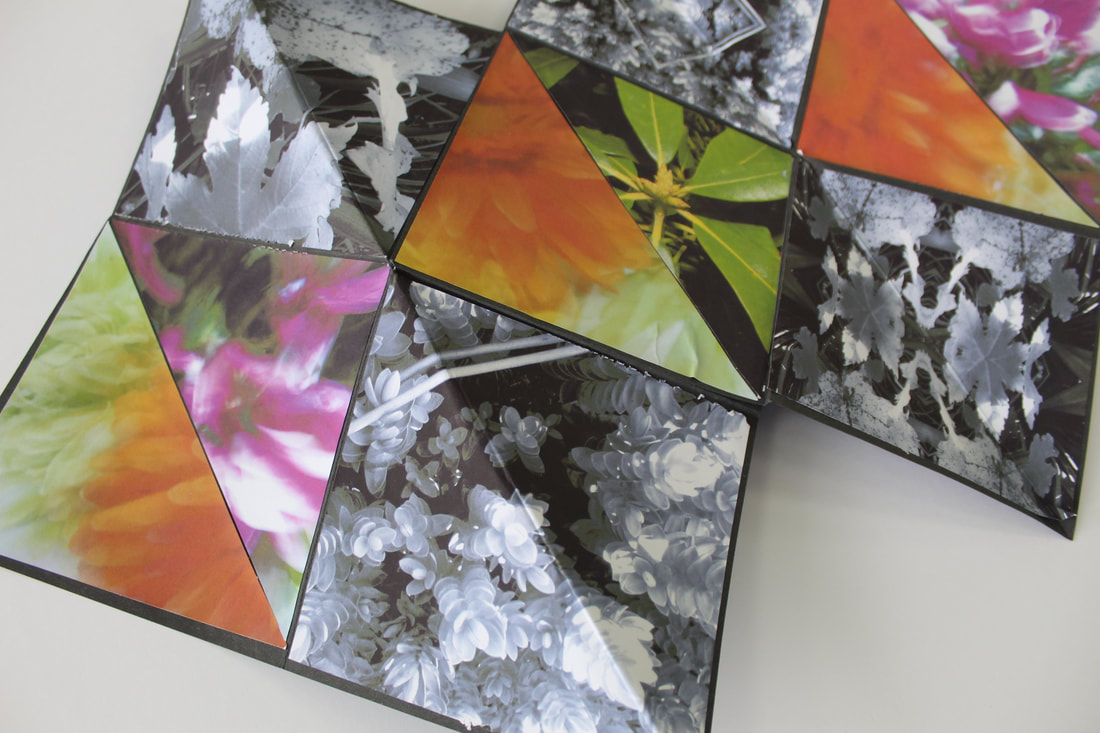
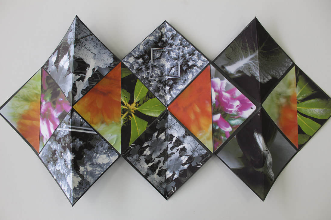
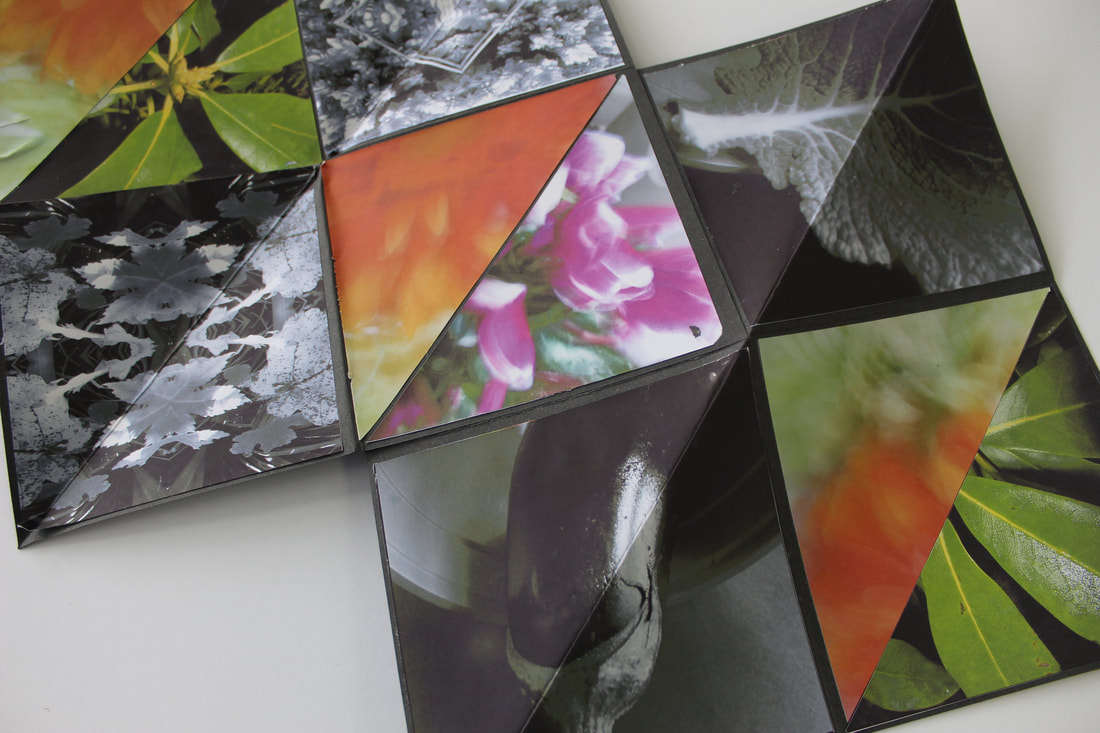
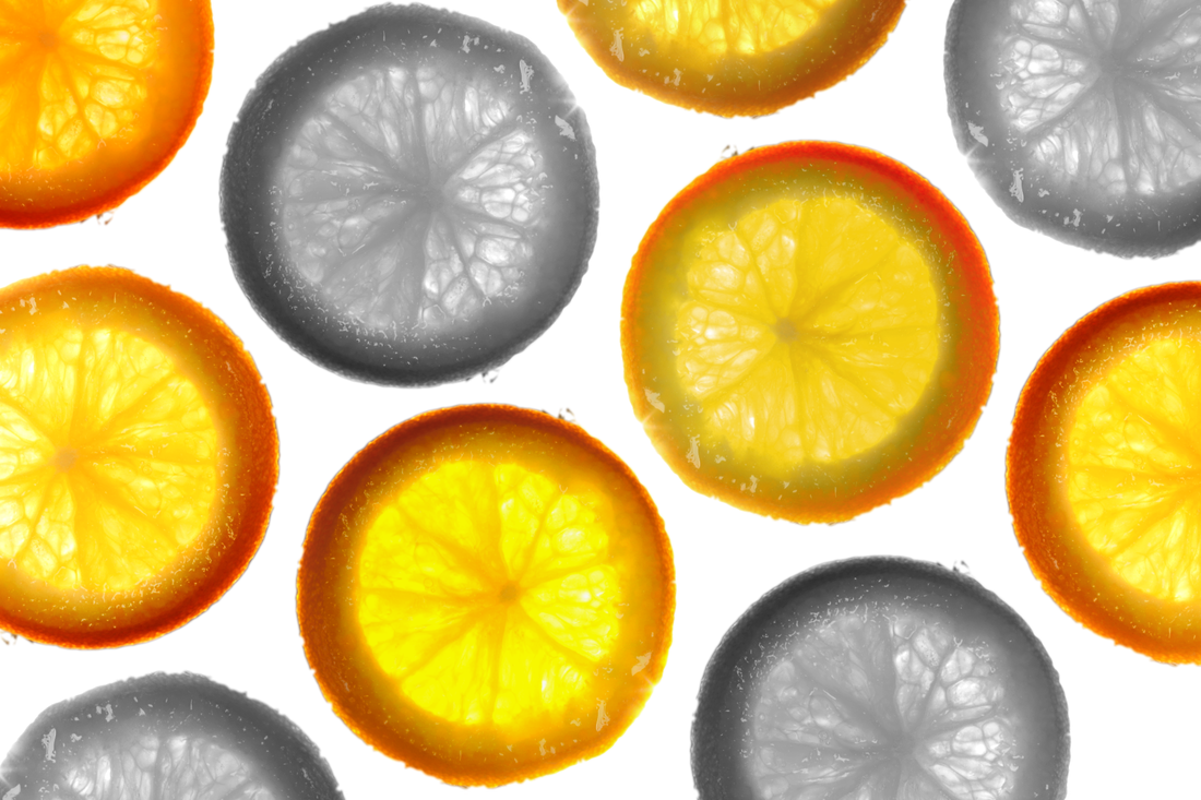
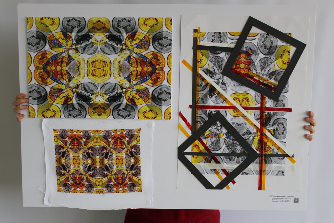
Rotational Design/ Dennis Wojtkiewicz

|
|
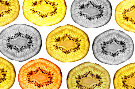
|
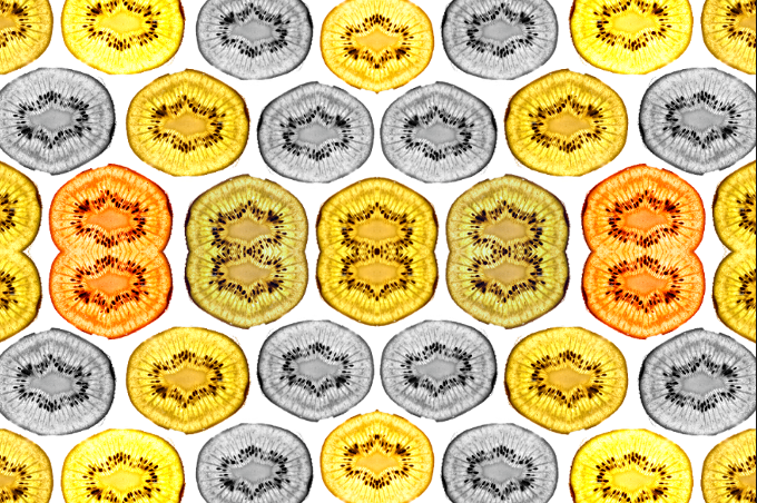
|

|
|

Collage Process - Y10 Mock

Final Outcome - Year 10 Mock Exam
Abstract Nature / Final Evaluation
Throughout this project I have developed my understanding of photography and the ability to create different photos using a camera. Before exploring the theme of Abstract Nature I had no understanding of what it was about and how to use different settings on a digital camera. Some of the key skills I have learnt are : monochromatic photography , intentional camera movement, shallow depth of field, low key photography , cyanotypes and high key photography. I have also developed the ability to write SEMI annotations and using the editing app Pixlr E.
Throughout this project I have further developed my understanding of abstract photography by exploring the theme of nature and researching different artists. I have looked at a range of different subjects such as flat fruit slices in the most recent shoot and also plants. This has allowed me to develop my understanding of the key elements of art such as : line, shape, texture, form, tone, colour and space. And also the principles of design such as : balance, rhythm, pattern, emphasis, contrast, unity and movement. I now understand the benefits and process of abstraction.
The first artist I produced research on was Edward Weston, this is because I was inspired by his compositions of low-key and still-life genres such as his most popular image 'Pepper No. 30'. Many elements have been used throughout the process of my research on Weston an example of this is form, tone, balance and contrast. These are displayed in my own photography work. Through research I learnt more about low-key photography and the impact it has on photos with the amount of detail it adds to photos. Inspired by his work I created a series of emulations by putting a vegetable such as a pepper in a plant pot to create the dark space around the background. I investigated the technical processes of rule of thirds in my semi analysis and the shallow depth of field setting on my DSLR camera. I feel as though his work helped me begin to understand the theme of abstract nature because the subject is completely different from the background meaning it stands out, his is also very abstract because of the differences. However I think I lacked some skill throughout these emulations and my skills have developed since studying the artist Edward Weston.
The second artist I researched was Anna Atkins, who is a 19th century photography and botanist, who mainly produces cyanotypes in her work. Her work with cyanotypes linked well to our topic of abstract nature because her work was mainly focussed on nature. The process of cyanotypes really intrigued me, the technical employment of light and deliberate selection of specimens based on transparency or opaqueness, this was something I took into consideration throughout the process of my emulative work. Her work also helped me to understand how photos used to be taken and the technology that goes into taking digital images nowadays. For my emulations I created three paper versions, a small fabric square and then also acetate to create a negative, the process I enjoyed the most was the fabric emulation.
After we studied the work of Anna Atkins, we briefly researched the artist Man Ray, who was a visual artist who mainly focussed of producing photograms which are a photographic image made without a camera by placing objects directly onto the surface of a light-sensitive material such as photographic paper and then exposing it to light. By looking at the artist Man Ray I saw further methods of abstraction as his work takes advantage of the monochromatic product but deliberately focuses on aspects such as shape and composition, yielding constantly varied, dynamic and abstract outcomes.
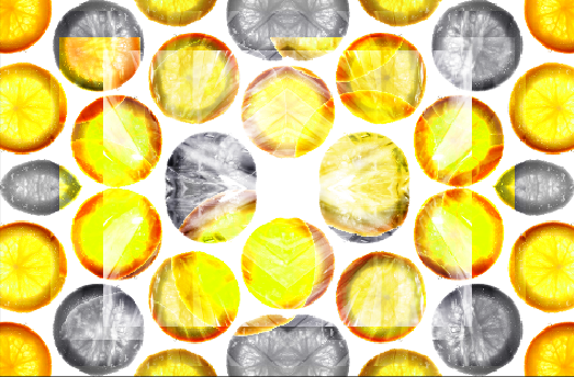
To further develop the abstraction in earlier final outcomes, I then took inspiration from fashion photographer Horst P. Horst. His use of rotational symmetry means his work is defined by principles such as pattern, symmetry, and in particular unity. Because of this his work appears to have a lot of texture. For my emulations I used my previous work from the Edward Weston shoot and Cyanotypes. I feel as through these were some of my most successful final outcomes as the composition felt immediately convincing and compelling and it was not something that required much careful thought beyond the initial cropping of the image to create more dynamic rotations.
I then went on to research the photographer Karl Blossfeldt. This still life, German photographer allowed me to explore a new lighting style, in stark contract to my previous Weston work: high key photography. I enjoyed my research of Blossfeldt's simplified yet effective style which employ a different combination of artistic principles to create enticing semi-abstract imagery. His subjects were not rare but his use of magnification (that I replicated in my use of macro/ close-up photography with aerial aspect) placed common natural specimens in a state of semi abstraction, placing these seemingly 'obviously' organic objects against a blank background- away from the context of our objective associations. This use of restful and balanced composition feels unnatural as it is completely manufactured; this in combination with the exaggeration and emphasis placed on the now 'strange' forms enabled me to explore a new notion of abstraction. I felt my composition and editing showed the influences from Blossfeldt's work.
The Final artist I investigated was Dennis Wojtkiewicz. I was inspired by the incredible hues and implications of backlighting in his hyper-realistic paintings. Looking at his work gave me the opportunity to explore backlighting in order to highlight intricate detail and texture within a semi-translucent subject. I was also able to explore colour saturation and emphasis in my final outcomes from this shoot. I followed a more tedious digital editing processes for this shoot as I had to remove the background of the images using the magnetic lasso tool, as well as experiment with different saturation, hue and tint to add more details to a bland image. In my final composition I used emphasis by repeating layers of the edited fruit and leaving some in monochrome tone to enhance the two highly saturated hues. During this shoot I also looked at macro photography as Wojtkiewicz's work utilises intense detail and texture. I used a reverse ring to experiment with some extreme macro shots and a macro lens to capture the incredible details revealed through the backlighting of the fruit and enhance the textures in the final edits as much as possible. This was extremely successful and added a layer of depth and further abstraction in my rotational edits and overlay experimentation. I feel my final outcomes from this investigation were the most successful as I not only managed to emulate the core features of the artist's work but was able to add a further layer of abstraction through overlaying from earlier rotational work which emphasised the tones and tints.
To summarise, I believe my most successful outcomes of this project were my early rotational work and especially my edited rotational Wojtkiewicz outcomes. In these outcomes I used a combination of all my most successful outcomes: monochrome final edits; Horst P. Horst rotational work and Dennis Wojtkiewicz rotations, to create these final edits, that I feel epitomised the theme: abstract nature. I employed my knowledge of composition throughout and focussed my colours, to create vibrant, saturated and contrasting images.
On the other hand my main weakness in this project was my lack of knowledge of technical processes and, as a consequence inability to accurately describe the processes and camera settings in a shoot. I feel at times I struggled to justify why I had selected a certain aperture or ISO and could not always confidently manipulate camera settings to gain the desired outcome.
